
5 best practices for ecommerce landing pages
You might think that having a product page is enough to get the conversions you need, but you could be missing out on even more. Compared to landing pages, product pages across the board underperform when it comes to getting conversions. This could be due to the customer’s attention being grabbed by something else, or the page itself doesn’t compel them to buy. To help, we’ve come up with the five best practices for eCommerce landing pages that you can start implementing today!
Use multiple CTA buttons
All advice you will be given for landing pages will suggest only having one call to action, which is correct. However, this doesn’t mean that you should only put the call to action on the page once- as long as it’s necessary.
This is ideal for pages that go into detail about the products or encourage a higher level of engagement from the reader compared to the average landing page. Having the call to action on the page more than once, but in areas that are appropriate, is a great way to draw the attention of the visitor back to completing the conversion. It is recommended that you have at least one call to action ‘above the fold’ (above the last point of the page you see before scrolling down).
Another CTA button can be put after a descriptive bit of text reminds the visitor what to do if they like the sound of what you are offering, and removes the need for them to look for that precious button again. For example, you might place your ‘Add to Cart’ button at the top of the page, with the hero image and price. An additional place to put it would be further down the page, underneath the detailed product description.
However, you don’t want to put the call to action after every piece of information or text however, as this can come across as ‘spammy’ and not user friendly.
Ensure it is optimised for mobile
The overwhelming shift in the past few years has seen over half of the website visitors making purchases on their mobile phones, while a majority will use their mobile to research the decision before making a purchase.
All this means that your landing pages need to be optimised for mobile use. If not, then you are risking losing out on a large percentage of potential customers.
Form functionality
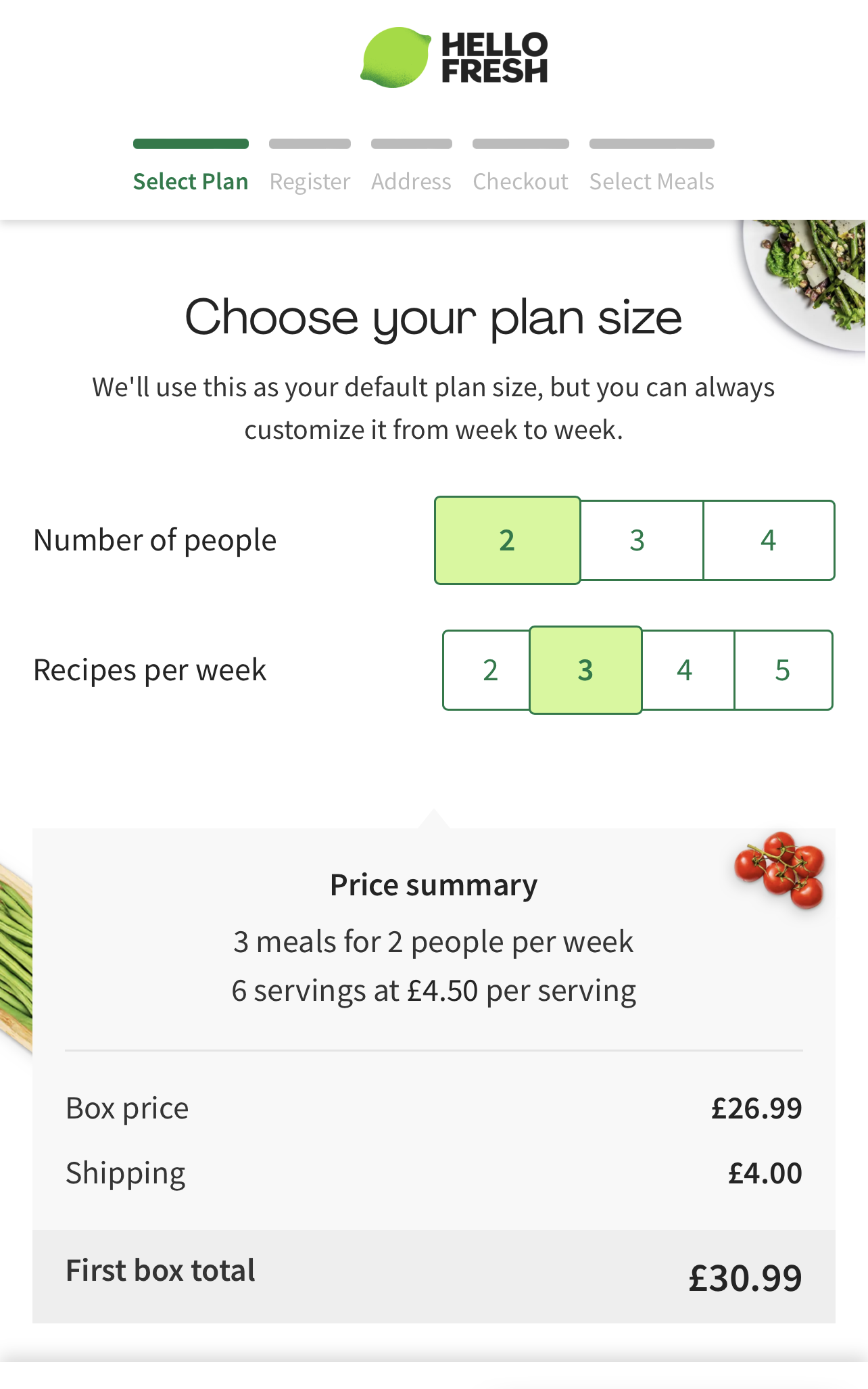
Some simple things you can do to optimise for mobile are making sure all buttons and forms work while on a mobile device and designing a specific mobile landing page that fits the size of various screen sizes. Take a look at the example given of HelloFresh’s form that is optimised for mobile devices. The user is able to scroll down for the recipe boxes that suit them, and the steps of the form have been laid out clearly at the top while not taking up as much space
Easy ways to convert
If you are offering a service and want to start drawing people in, chances are you have a demo or trial version for people to sign up for first. A ‘soft option’ if you will. This is the type of offer that allows people to test out your service and make an informed decision to continue or not. It may seem simple on the surface, but it is also a great way to increase the lifetime of a customer- they are less likely to sign up, pay and then leave after a month if they have already tried your service and like it.
Making this easily accessible for your landing page visitors is one of the best ways to encourage conversions. If they don’t know the trial is available, they can’t sign up for it! In contrast, if it is one of the first things they see when they reach your landing page, they won’t be able to forget it.
Be specific about your offer
Throughout the year, you will likely be running various sales campaigns or seasonal offers. You will need separate landing pages for each of these so that it doesn’t get confused with other offers or items that aren’t included in the sale/offer. Additionally, the use of a specific, dedicated URL for the page will allow users to find it again more easily while also optimising your website for SEO.
Having copies and images that relate solely to the offer at hand keeps the visitors focused on the one purchasing decision they need to make. Having more than one could mean that the visitor feels that the decision was too hard to make and so doesn’t purchase anything.
Get rid of distractions
Removing distractions from your landing page is another way to ensure the focus is kept on the one singular offer you are promoting. Distractions can include having different calls to action across the page- for example, ‘buy this now’ and ‘sign up here’. You can be sure that some of the page visitors will only do one action, and not necessarily the one you want them to take.
Another suggestion is removing navigation away from your landing page to your main website. This may seem like a bold, maybe even scary move, so let’s break it down with an example:
Your online store is running a special event, such as a ‘Black Friday’ sale. You want as many people to know about this sale and take part in it. While creating your landing page for the sale, you leave the navigation on and viewers then look around your website more than they do at the sale. This is likely to lead to more people leaving the site without buying anything, as they become overwhelmed with the choice, or buying items that you aren’t heavily promoting. As this happens, the number of completed transactions is reduced and therefore make your marketing efforts look less effective.
However, if you were to remove the navigation, more people would stay on that particular landing page rather than browse across your whole site. This, in turn, would prove your marketing campaign to be effective and worth the time and money put into it.
Make them feel special
Some landing pages aren’t for everyone. There will be times when you will want to celebrate your current customers or brand new ones, and that’s great! To do this, you will need to set up a select landing page that is only accessible when given the direct link, such as through an email campaign. This will make it feel more personalised for the individual, as they know they are getting something special for them.
Or maybe you are trying to speak to a predetermined group of people that need a certain message.
Mattress makers Simba made a specific landing page, designed to attract those who are comparing them and their competitor Emma. For these people, it would draw them in, give them the necessary information to make the decision while pulling them towards making a purchase with Simba.
A/B testing to ensure the right fit
A/B testing is a vital part of any landing page creation and optimisation. It is the method of trialling two variations of the same page during a defined period of time, to two different groups of website visitors to see which drives more conversion.
You may think that your landing page is the best it can be, but you won’t know for sure until you put it to the test. What you may find is that web visitors to the landing pages prefer a different placement for the price, the length of the product description or the pictures used to present the products. Have this in mind when you are creating your landing page, and keep an open mind about making these changes if they are needed.
Social proof!
It’s a well-known fact that people trust what other people say more than what businesses say. So put that to good use! If you have reviews of the product on your landing page, put them on there. Allow your visitors to see all the great things that other people are saying, so you don’t have to say it.
Having social proof on your landing page adds an element of trust for the visitor that you as a brand won’t be able to replicate. An example of this would be putting a small selection of reviews onto the landing page to give the web visitor other perspectives on the purchase they are about to make. Of course, you can be selective about which reviews you select, but even the act of seeing other people’s opinions on the product (or even your company) can push people further towards making that purchase.
Another great option, for those more visually inclined, would be to include the first 10-15 posts from your Instagram feed. When doing this, it is good practice to frequently repost other users’ images to your own business feed. This has multiple benefits, including increasing the number of people who post about your product on Instagram, creating a frequently used branded hashtag, and making your customers feel seen by acknowledging their posts.
With all this in mind, you can now start to optimise your eCommerce landing page
Following these best practices for eCommerce landing pages, you are now ready to go and create or optimise your pages for maximum conversions! If you would like any more information or support with your landing page, contact us today!
Responsive Web Design In the past it was completely necessary to have a separate mobile version of a website as Read more

What is UX Design and Why is it Important? UX stands for User Experience. The truth is if you have Read more

Google is constantly making changes to its algorithm and how it ranks websites on their organic search results page. This Read more

Let’s just take a short moment to visualise a scenario. Imagine yourself walking down a street filled with shops and Read more